

What is a userbar?
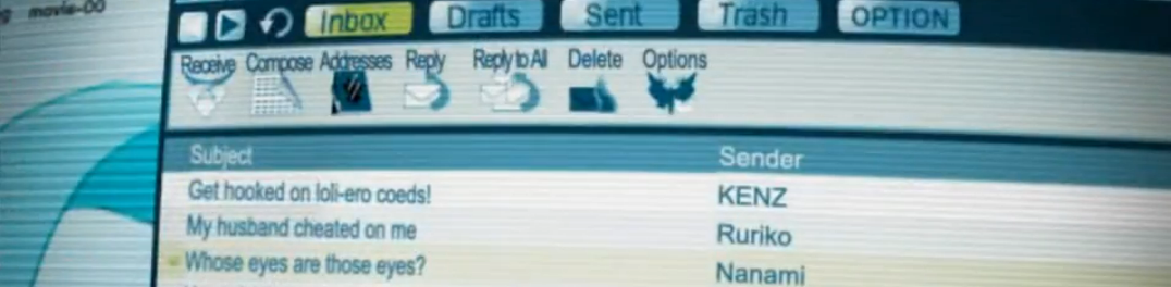
Userbars are 350x19 images that usually denote one's fandom or personal attachment to a topic. Said images were stacked in countless forum signatures across the world wide web at the apex of forum culture back in the 2000s, often forming a lethal combination when paired with Linkin Park lyrics and anime quotations.
Unfortunately most of the websites which once curated user-submitted userbars have sadly went offline, leaving behind only shoddily-preserved archive.org pages in their wake. But on the flip side, userbars are quite easy to make!How do I get my own userbar?
Method 1: Use a third party program
The easiest method to creating your very own userbar is probably by using one of the ancient generator programs. Out of the ones I've come across, the AmitySource Userbar generator seems to be the one with the most features to it. Of course, by using such a program you will often be forced to stifle your creative vision to some extent. This leads into the next method.
Method 2: Do It Yourself
Things that you will need for this tutorial:
My Userbar Template
Paint.net
BoltBait's GPU Accelerated Plugin Pack
Visitor TT2 BRK font
The method that I personally use is the good old fashioned DIY one. Though you can use any image editor for this, I find paint.net the easiest to use when it comes to handling raw pixels so this tutorial will be done using it. I will also attempt to streamline the process as much as possible so that even those without much image editing experience can make their own userbars.
You will want to first start off by downloading my userbar template. I've included a (Handmade) gloss effect as well as layers that describe how it all works and where to put everything. Once you open up the userbar template in paint.net, you will be met with something like this.
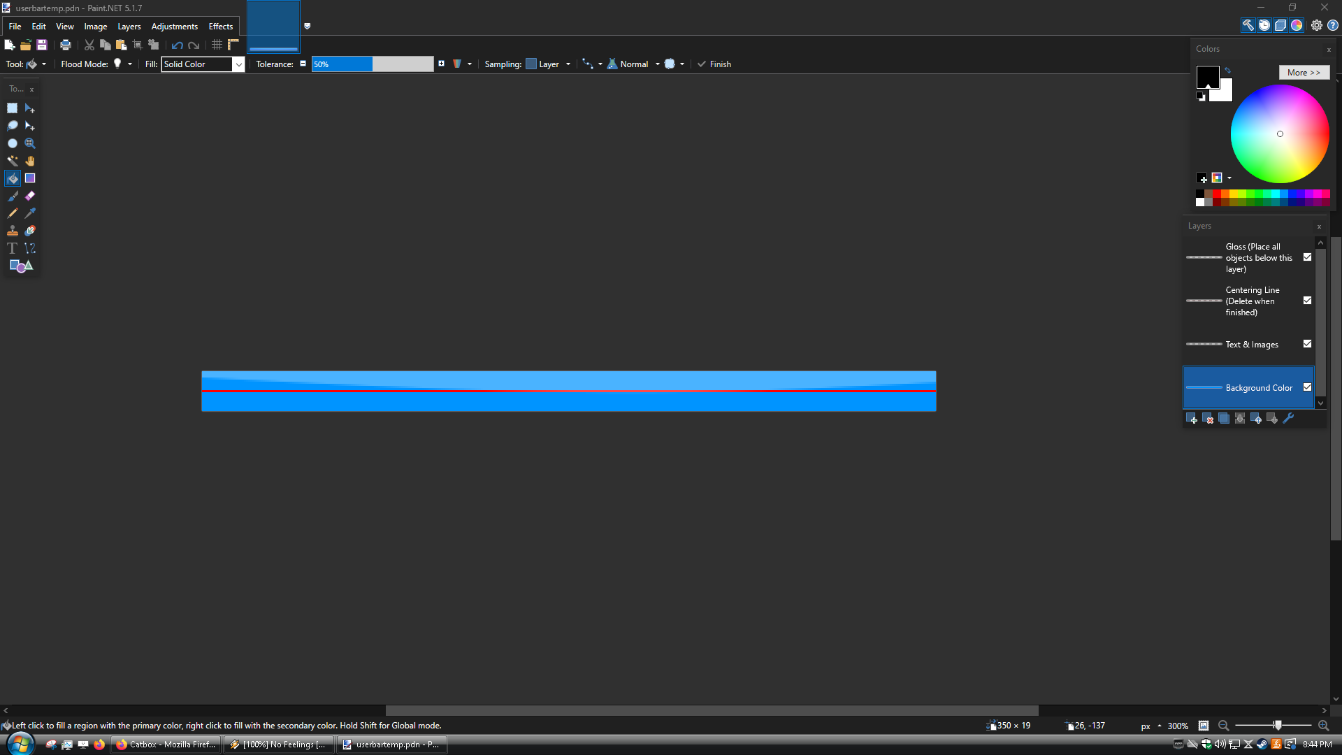
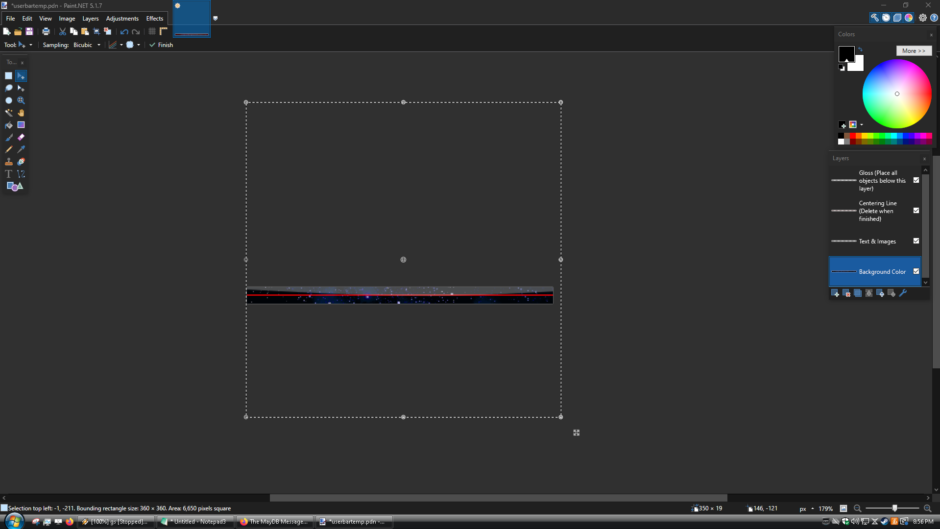
For the sake of the tutorial, we're going to go chronologically corresponding to the order of the layers. The first layer is where you will put your background colour or image. This is as simple as using the paint bucket tool (Keyboard shortcut: F), selecting your preferred colour, and clicking the left mouse button. If you want to use a background image, you will want to copy and paste it your desired image onto the canvas (make sure to select Keep Canvas Size when doing this). Due to the abnormal size of the canvas, you will often need to do some resizing, which can be done by using the circles surrounding the image that appear after copy and pasting it, pictured below.
Once you've settled on a background, it's time to start spicing it up with some decor. Select the "Text & Images" layer. You will want to find images of characters or objects from the subject that your userbar is about that do not have backgrounds, so as to not interfere with your chosen background image. An easy way to do this is to look up "[Character name] render" in your search engine of choice.
If it's a reasonably popular show chances are someone has already made renders for it. You can also make your own renders, but this can be a bit timeconsuming so only do this if you really can't find anything; due to the lack of vertical height, chances are most of the render will not be visible anyway so don't worry too much about getting the best possible image.
After a bit of trial and error, I settled on this for the core design.
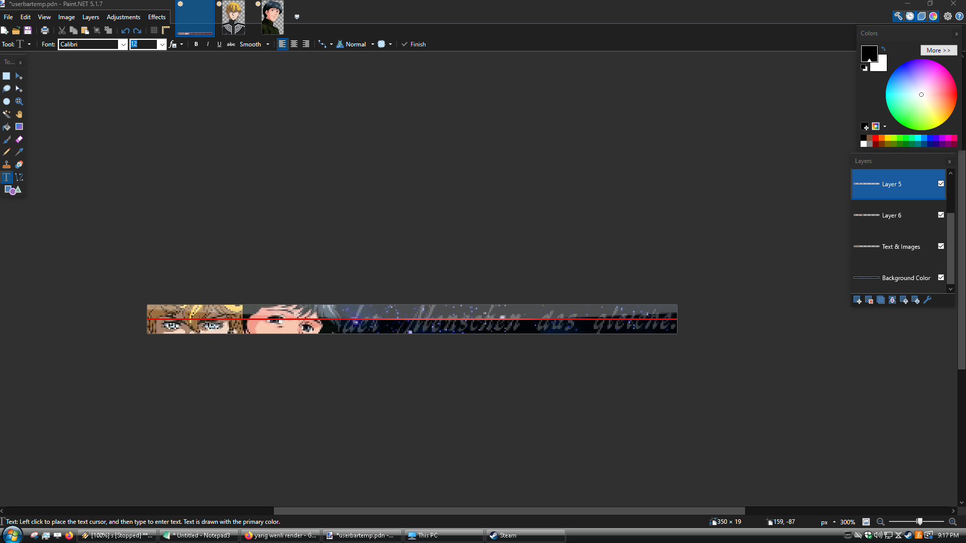
When designing userbars, I attempt to assign meaning to the different elements present within. In this case, Yang and Reinhard's rivalry and the ideological clash at the root of it is one of the core themes of Legend of the Galactic Heroes. In a similar vein the faded out German text also represents a core theme of the series, partially translating to "The deeds of men remain the same." in English which LOGH features prominently in it's opening title card as a means of criticising presentist thought.
You may notice that I've added a few new layers; this is for a few reasons. Layer 6 was created In order to achieve the faded out text effect over the background. To accomplish this I found the still from the show, selected the portion of the text I wished to use, and then pasted it into a new layer. After a bit of resizing, I opened up the layer Properties tab (Shortcut: F4) and set the opacity so that it would fade into the stars in the background.
The other layer was made because if you have two renders on the same layer side by side, the transparency will overwrite the other render. As such, I made a new one to cleanly overlay the two. I also added in a small touch of a faded spaceship in the background by repeating the trick with layer 6. If you have excess layers like I do, go ahead and merge them down to avoid clutter. When messing with transparency effects like I have for this bar, you will want to merge the layers one by one. Do not just spam click layer 5 and layer 6 down at the same time, instead you want to merge layer 5 into text & images and then merge layer 6 into text & images, etc. Speaking of text...
It's time to add in the text. This is where the Boltbait plugin pack as well as the font comes into the fold, as you will need it for this stage. First you want to make a new layer, make sure it's under the Centering Line and Gloss layer but above the Text & Images layer. Then select the text tool (Shortcut: T), set the font to Visitor TT2 BRK, the number beside it (font size) to 9 pixels, and set the text rendering to aliased. Since the aliasing can be a bit hard to find, I've highlighted it in the below screenshot; it's the furthest off to the right in the picture.

Now I know that a few of you have probably been wondering for a while, "WHY IS AN UGLY ASS RED LINE IN THE CENTER OF THE SCREEN?". There is actually a reason for this! Once you've typed the text, you will want to select it using the Rectangle Select tool (Shortcut: S) and position it off to the right of the userbar. When doing this, the red line will help you center the text properly. Your end result after following these steps should look like this.
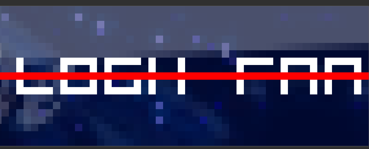
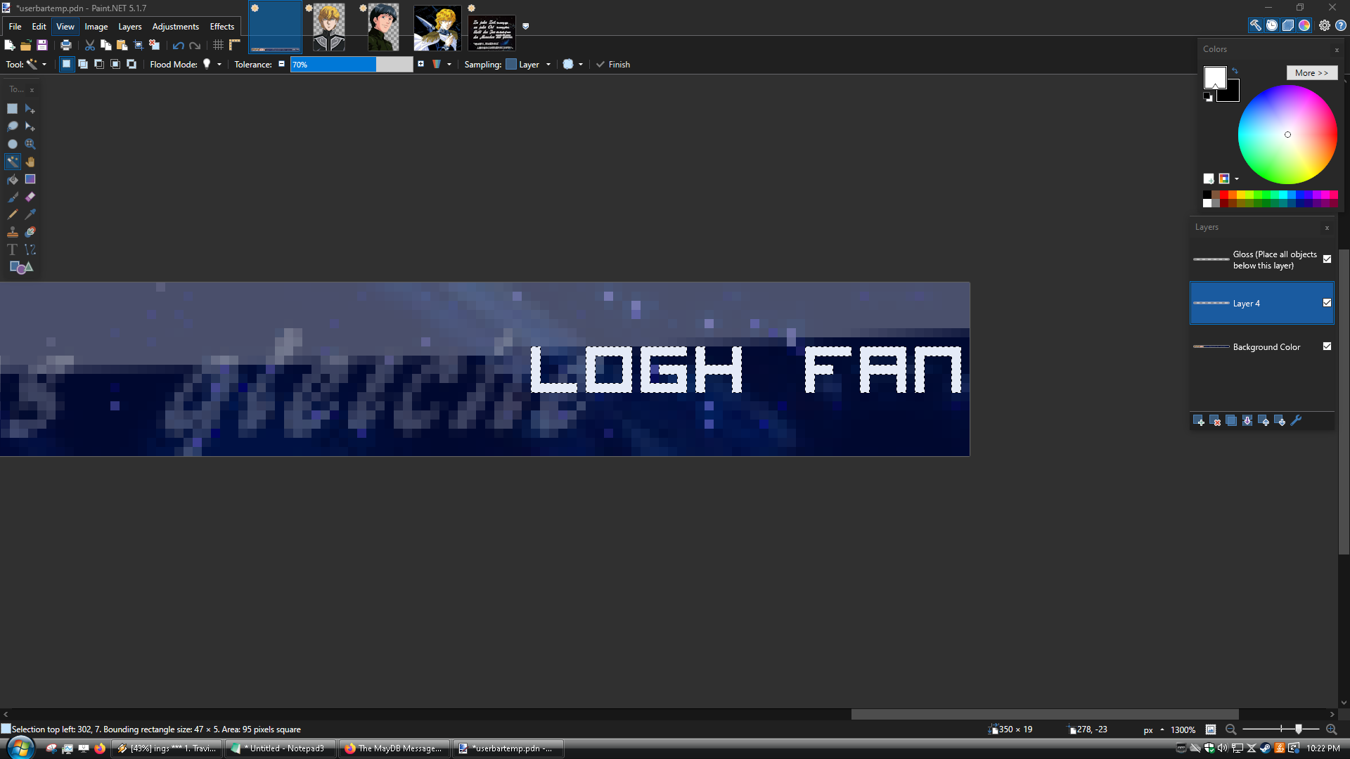
You can now delete the layer containing the red line, if you'd like. Next, go to your layer holding the text, select the magic wand tool, and then hold control + shift and while holding the two perform a left click over the white of the text. You should select all of the text, like so.
Now go into your effects menu, hover over selection and then select the outline selection plugin. Set your settings as shown in the below image.
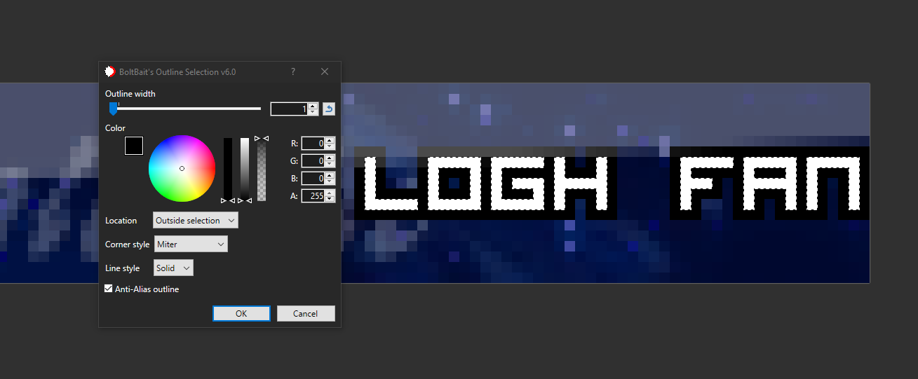
Your userbar is now complete! Merge ALL of the layers properly (again, make sure to always merge them down one by one as I explained earlier), otherwise you won't be able to save it as a normal image file. After you've merged them, hover over file and click save as, then click on save as type and change it to .PNG. You are now done! Here is our end result.

Method 3: Request One In This Thread!
Since userbars are fairly simple to make, I am open to taking requests in this thread. Just fill out the following prompt, leave it in a reply, and I'll try to get back to you.
1. What do you want your userbar to be for? Whether it's a show, book, for a console you own, or anything in between.
2. What specific characters, objects, or verbeage do you want on the userbar?
3. What background colour or image do you wish to use?
Thanks for reading the userbar thread, and hopefully this can serve to be informative for some of you.4. What should the text say?
 1
1














 2
2




 1
1





 1
1

